ABOUT THE PROJECT
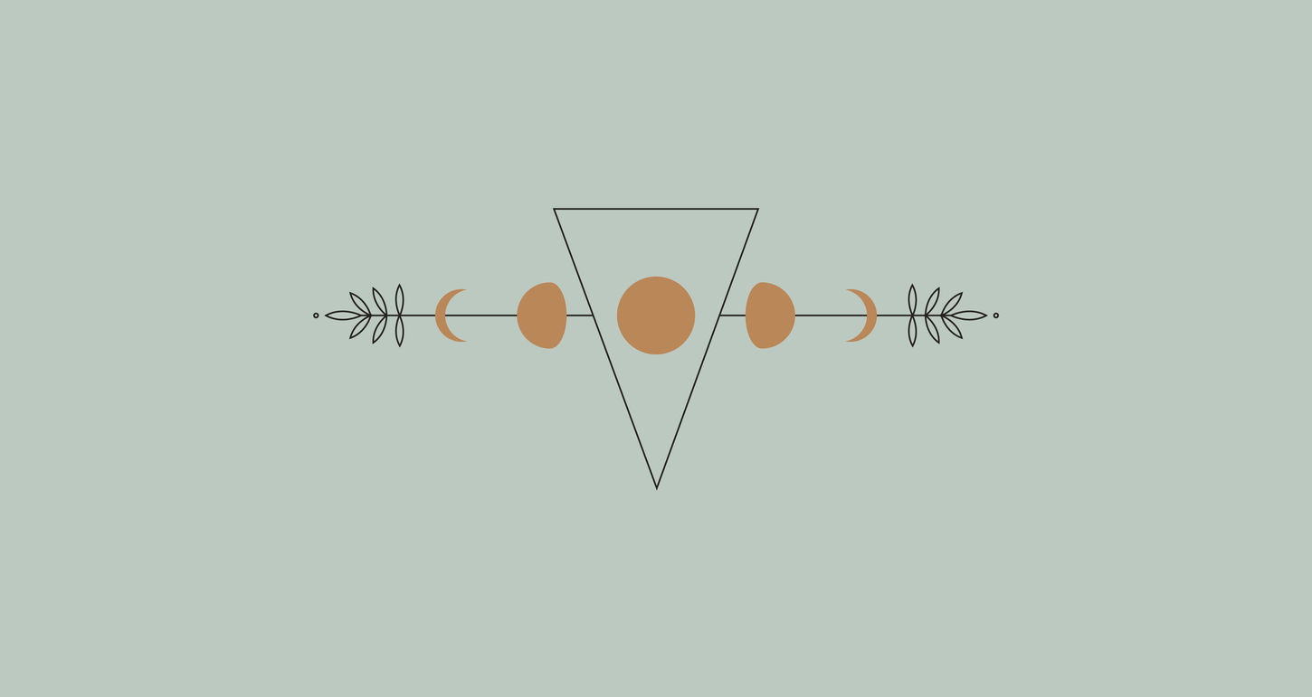
Howl at the Womb was a full branding/visual identity job. The client wanted to create a minimal yet intricate design that created a celestial sense of power and strength. We created a logo and overall branding identity that worked within this constraint and set the tone for the entire visual identity connected to the brand. The main inspiration behind the design was the idea of a full moon cycle playing off it's connections to growth, mother nature, and fertility.
We designed the website focusing on curating imagery that fully represented the brand and the demographic they serve. The design features a consistent layout pattern with custom designed info graphics and curated imagery. We played with minimal layering to give the graphics some depth as well as brought in the brand color story through the imagery we used.
View their website HERE
View their instagram HERE
Client /
Cindy Luquin
Role /
Branding Design
Website Design
Agency /
Howl at the Womb
Year /
2019
BRAND IDENTITY
We created a full brand identity for Neuma Being, this included a primary, secondary, and icon logo design for versatility of the visual brand.
WEBSITE DESIGN
We designed the Howl and the Womb website, focusing on usability and full representation of the brand and the community it serves.


